])
]) ![]() [])
[])
The vegan package includes several functions for adding
features to ordination plots: ordiarrows(),
ordiellipse(), ordihull(),
ordispider() and ordisurf(). This package adds
these same features to ordination plots made with ggplot2.
In addition, gg_ordibubble() sizes points relative to the
value of an environmental variable.
The functions are written so that features from each can be combined in customized ordination plots.
The functions ord_labels() and
scale_arrow() (used to ensure vector arrows fit within a
plot) are exported to make it easier to generate custom ordination
plots.
You can install the development version of ggordiplots from GitHub with:
# install.packages("devtools")
devtools::install_github("jfq3/ggordiplots")
You can install the latest release from CRAN with:
install.packages("ggordiplots")Plot an ordination with ellipses around treatment group centroids (at
distances of one standard deviation) with
gg_ordiplot().
library(ggordiplots)
#> Loading required package: ggplot2
#> Loading required package: vegan
#> Loading required package: permute
#> Loading required package: lattice
#> This is vegan 2.6-4
#> Loading required package: glue
data("dune")
data("dune.env")
dune_bray <- vegdist(dune, method = "bray")
ord <- cmdscale(dune_bray, k = (nrow(dune) - 1), eig = TRUE, add = TRUE)
#> Warning in cmdscale(dune_bray, k = (nrow(dune) - 1), eig = TRUE, add = TRUE):
#> only 18 of the first 19 eigenvalues are > 0
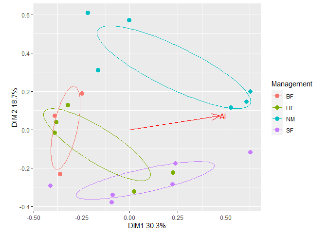
plt1 <- gg_ordiplot(ord, groups = dune.env$Management, plot = FALSE)plt1 is list with items named:
names(plt1)
#> [1] "df_ord"      "df_mean.ord" "df_ellipse"  "df_hull"     "df_spiders"
#> [6] "plot"
The first 5 items are data frames for making plots. The last item is a ggplot:
plt1$plot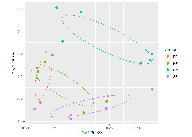 Fit a vector of Al concentrations to the ordination with
gg_envfit().
Al <- as.data.frame(dune.env$A1)
colnames(Al) <- "Al"
plt2 <- gg_envfit(ord, env = Al, groups = dune.env$Management, plot = FALSE)
plt2$plot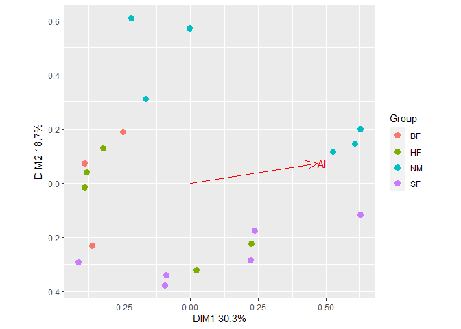 Add ellipses from the first plot to the second plot. The resulting plot
can be further customized using usual
Add ellipses from the first plot to the second plot. The resulting plot
can be further customized using usual ggplot2 methods. For
example, change the legend title.
plt2$plot +
  geom_path(data = plt1$df_ellipse, aes(x=x, y=y, color=Group)) +
  guides(color=guide_legend(title="Management")) # Change legend title